Hello visitors, welcome to my art blog. :) I am a student at University of the Pacific and I am working on getting my B.F.A. in Graphic Design.
Tuesday, December 7, 2010
So I re-blogged this thing on Tumblr a long time ago from another blogger I follow and I just saw it again and thought I would post it on here. I think the image has an important message that applies to everyone, but as artists, I think its even more important for us to remember this. Whenever we create anything, there is always going to be mistakes, and I don't think you could be successful as an artist if you always shot for complete perfection. A lot of the time artist make those mistakes, which is sometimes exactly what their piece needed to be complete. Basically, don't be afraid to make mistakes. I know majority of the time I am, and possibly thinking to much that I cannot make a mistake while doing this project. So I constantly need to remind myself not to be afraid to make mistakes.
Monday, December 6, 2010
Album Artwork: Anywhere But Here
In this artwork, the intent and goal of it is to show the meaning and overall theme of the album, while advertising and bringing some focus on who the band is as well. I believe the artwork accomplishes this in several ways. First, the images and figures used in the design. The faceless man in a suit is the same figure used in their previous album artwork. As seen in the first one there is a faceless carrying a red umbrella. In this album there is a man walking with an umbrella towards the faceless man, which actually seems to be the same man. These figures help fans create a recognizable image
Kyle Crawford did a good job at showing the meaning and intent behind the album artwork. I believe it is portrayed well with the use of the images and color in the design. The initial impact of the artwork brings the romantic and traveling thoughts to my mind, as well as, reminds me of the band right away. This design is a very good one that fits the band and their album.
Sunday, December 5, 2010
Knowledge and Creativity: How I Like It
In my first short essay on knowledge and creativity I said that creativity comes from knowledge. An artist needs some basic knowledge to create something creatively, which could be as basic as knowing how to get paint on a paint brush. Creativity comes from knowledge, which is the base of everything. There is always some knowledge while creating anything, which is how knowledge and creativity interact with one another for me. With more than just basic knowledge of how to work tools, I like to see to see more knowledge used in art pieces, where it makes you think more about the meaning behind the piece created. For example, I really like to see album artwork portray the lyrics of the songs or overall theme of the album. Many of the albums I own have very interesting artwork that when viewing it, makes you think about the meanings and different interpretations of the songs with the lyrics.
For example, the last album this band called Alesana released, has a complete story from beginning to end with the songs on the album titled, “The Emptiness.” Besides having an album booklet that has lyrics and artwork meshed together to give the visual image of the songs, there is also a second booklet that is titled “The Emptiness: A Story Told Though the Eyes of a Sketch Artist.” The main booklet containing the lyrics has very creative images that go along with what the lyrics are saying. Then in the second booklet it contains more typography with a complete story having short chapters and then there are sketches that emphasize the main words of the story, using dramatic, intense writing. Both booklets show knowledge and creativity working together, and I believe the creativity is strong in this album because of the second booklet added to it.
For example, the last album this band called Alesana released, has a complete story from beginning to end with the songs on the album titled, “The Emptiness.” Besides having an album booklet that has lyrics and artwork meshed together to give the visual image of the songs, there is also a second booklet that is titled “The Emptiness: A Story Told Though the Eyes of a Sketch Artist.” The main booklet containing the lyrics has very creative images that go along with what the lyrics are saying. Then in the second booklet it contains more typography with a complete story having short chapters and then there are sketches that emphasize the main words of the story, using dramatic, intense writing. Both booklets show knowledge and creativity working together, and I believe the creativity is strong in this album because of the second booklet added to it.
Knowledge and Creativity: Designers
While browsing the Internet for graphic designers, I came across two designers whose work I enjoyed looking at. The first one I came across was David Airey from Ireland. His client list has companies from all over the world, stretching from England to Japan and Canada. The work in his portfolio online is a lot of brand mark and stationary work, with clean cut edges. In the work Airey displays on his website, there does not seem to be a whole lot of color in any of the pieces. It is more like white, gray, and other dull colors. The images are very professional looking, for sophisticated companies, with simple details that get right to the point of what he is trying to convey in the designs. This is why I like Airey’s designs, he has strong knowledge behind his work. In today’s society, people move at a fast pace and enjoy immediate satisfaction from pretty much anything. His designs are easy to read and people can immediately understand what the brand is about or trying to sell. The designs are simple and clean cut, but they are still pleasing to look at.
The second designer I came across had more spice to her designs, using more color and different images. Jessica Greenwalt, from the bay area, definitely adds more to look at to her designs. Her clients range from the west and east coast of the United States and in the United Kingdom. Her portfolio on her website features work with website designs, prints, packaging, logos, and illustrations. Greenwalt uses strong creativity in her designs with many different colors and shapes that makes one look at the piece a little longer because there is more for the eye to look at. The designs have more fun colors and shapes, such as bright reds and blues, and some cartoon like illustrations, which shows her creativity and is enjoyable to view.
The second designer I came across had more spice to her designs, using more color and different images. Jessica Greenwalt, from the bay area, definitely adds more to look at to her designs. Her clients range from the west and east coast of the United States and in the United Kingdom. Her portfolio on her website features work with website designs, prints, packaging, logos, and illustrations. Greenwalt uses strong creativity in her designs with many different colors and shapes that makes one look at the piece a little longer because there is more for the eye to look at. The designs have more fun colors and shapes, such as bright reds and blues, and some cartoon like illustrations, which shows her creativity and is enjoyable to view.
Monday, November 8, 2010
Sunday, October 10, 2010
"Ink Not Mink" ad campaign for PETA.
This is another very armature piece I did for my senior project, but it was probably one of my favorites. :)When I was needing one more piece to do for senior projects, PETA has this "Ink Not Mink" campaign going on sometime right before I made this. And the message with this one is to stop killing minks just to wear them, or really all fur in general. They had a bunch of celebrities involved in the ad, and of course ones that had tattoos. As Steve-O from Jackass said in an interview, "Abuse yourself all you want, just leave animals out of it."
But anyways, I remember I saw on PETA's website something about making your own ad by uploading a picture and using a background they have. I was thinking, "oh my gosh, that would be so cool for me to be in an ad like that!" But...I don't have a single tattoo on my body (yet haha). So I decide I'd make my own. I called up my cousin, took some pictures, and put everything together.
But anyways, I remember I saw on PETA's website something about making your own ad by uploading a picture and using a background they have. I was thinking, "oh my gosh, that would be so cool for me to be in an ad like that!" But...I don't have a single tattoo on my body (yet haha). So I decide I'd make my own. I called up my cousin, took some pictures, and put everything together.
Knowledge and Creativity
According to Dictionary.com, the definition of knowledge is, “acquaintance with facts, truths, or principles, as from study or investigation; general erudition: knowledge of many things.” People can find knowledge anywhere in the world; it surrounds us. From the beginning of schooling as a child, knowledge is drilled into people and as the schooling progress, more and more knowledge becomes available to us. However, knowledge does not just come from the classroom. It can come from the streets and other places in the world. Hence the terms “book smart” and “street smart.” It is the basis for everything that we know exist. From knowledge comes ideas, inventions, theories, designs, mostly anything you can think of. People need knowledge to create, so with creativity comes knowledge.
The definition of creativity, according the Dictionary.com is, “the ability to transcend traditional ideas, rules, patterns, relationships, or the like, and to create meaningful new ideas, forms, methods, interpretations, etc.; originality, progressiveness, or imagination: the need for creativity in modern industry; creativity in the performing arts.” Creativity is what adds flavor and spice to the world. It creates and puts out new ideas and concepts that is developed from one’s own imagination. Knowledge acts as the “traditional ideas, rules, patterns and relationship” that creativity is based from. In order for people to be creative and obtain creativity, they need knowledge to work off of. Creativity cannot exist with out the base of knowledge, and knowledge and creativity work together by making the person think critically and imaginatively.
The definition of creativity, according the Dictionary.com is, “the ability to transcend traditional ideas, rules, patterns, relationships, or the like, and to create meaningful new ideas, forms, methods, interpretations, etc.; originality, progressiveness, or imagination: the need for creativity in modern industry; creativity in the performing arts.” Creativity is what adds flavor and spice to the world. It creates and puts out new ideas and concepts that is developed from one’s own imagination. Knowledge acts as the “traditional ideas, rules, patterns and relationship” that creativity is based from. In order for people to be creative and obtain creativity, they need knowledge to work off of. Creativity cannot exist with out the base of knowledge, and knowledge and creativity work together by making the person think critically and imaginatively.
Sunday, September 26, 2010
Love it.
So I thought this was very appropriate. And I'm not gonna lie...I want this on my wall in my room. :)
Saturday, September 25, 2010
Paramore Album Cover
So a long time ago I made this album cover in art class and yeah its really amateur, but I've always liked it. Haha. It was for the song "Decode" and this is just what I came up with at the time.
Friday, September 24, 2010
Sunday, September 19, 2010
Daniel Dare Photography
For my art seminar class, we recently had to interview an artist and I decided to interview a photographer. Although I am a graphic design major, I think you need to be a good photographer too so that you can provide some of your own images for designs. So I got to interview young photographer, Daniel, out of the Sacramento area. I decided to ask him some questions dealing with becoming a photographer and his experiences and any tips or advice he has for future photographers.
1. How long have you been a photographer?
I have been actively taking pictures for about 3 years now. However, I have been working full time as a photographer since May of 2009, so about a year and a half.

 2. How did you become interested in photography?

 As far as I can remember, I have always loved photography. I remember being younger, and taking pictures of anything and everything. However, it wasn't until 2007 that I had the desire the be a photographer. I started out by taking pictures of concerts or shows, where I knew bands that were playing.
3. What is your favorite subject to photograph?
I would have to say that my favorite thing to shoot would be commercial assignments. I love compositing, and creating something that wasn't there to begin with.
4. What do you view as your biggest success so far as a photographer?
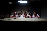
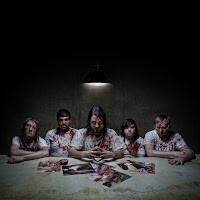
In April of this year, I was asked by the Los Angeles based band LoveHateHero to shoot a promotional photo for their summer U.S. tour. That was a big deal to me, and the photo ended up in quite a few magazines. Other than that, I see every new shoot that I do as a success, its always a learning experience, and I learn something new each time.
5. What are the challenges as a photographer?
One of the challenges I face the most is the weather. I shoot on location a lot, and very rarely in a studio. So the timing and weather always play a challenging role. Another challenge I have is patience. You can't rush photography, just like any other form of art, it requires extreme patience, especially with projects that require days upon days of photo re-touching and manipulation.
 6. How has Internet resources helped your business grow?
The internet is actually my number one marketing tool. It helps with networking faster than word of mouth, and in the times that we live in, internet based media is one of the most popular forms of communication.
7. Where do you see yourself in ten years with photography?
I'm not sure how to answer that actually. I try not to plan ahead, and just take things day by day, but if I think about it, I would like to be shooting full-time as an in-house photographer for different magazines and record labels.
8. In your opinion, what does it take to become a successful photographer?
Dedication. I believe that anyone can do anything (within reason), as long as they push for it and never give up.
9. Any advice or other information you would like to share for future photographers?
Like I said, push forward and never give up. There is ALWAYS room for improvement and growth. Stick through the tough times, and don't quit.
To look at Daniel's other work and websites go to:
http://www.danieldare.com
http://www.flickr.com/photos/danieldare
http://www.twitter.com/danieldare
http://www.myspace.com/danieldare
If you would like contact Daniel you can reach him at (916) 538-3273 or e-mail him at daniel@danieldare.com
1. How long have you been a photographer?
I have been actively taking pictures for about 3 years now. However, I have been working full time as a photographer since May of 2009, so about a year and a half.

 2. How did you become interested in photography?
 As far as I can remember, I have always loved photography. I remember being younger, and taking pictures of anything and everything. However, it wasn't until 2007 that I had the desire the be a photographer. I started out by taking pictures of concerts or shows, where I knew bands that were playing.
3. What is your favorite subject to photograph?
I would have to say that my favorite thing to shoot would be commercial assignments. I love compositing, and creating something that wasn't there to begin with.
4. What do you view as your biggest success so far as a photographer?
In April of this year, I was asked by the Los Angeles based band LoveHateHero to shoot a promotional photo for their summer U.S. tour. That was a big deal to me, and the photo ended up in quite a few magazines. Other than that, I see every new shoot that I do as a success, its always a learning experience, and I learn something new each time.
5. What are the challenges as a photographer?
One of the challenges I face the most is the weather. I shoot on location a lot, and very rarely in a studio. So the timing and weather always play a challenging role. Another challenge I have is patience. You can't rush photography, just like any other form of art, it requires extreme patience, especially with projects that require days upon days of photo re-touching and manipulation.
 6. How has Internet resources helped your business grow?
The internet is actually my number one marketing tool. It helps with networking faster than word of mouth, and in the times that we live in, internet based media is one of the most popular forms of communication.

7. Where do you see yourself in ten years with photography?
I'm not sure how to answer that actually. I try not to plan ahead, and just take things day by day, but if I think about it, I would like to be shooting full-time as an in-house photographer for different magazines and record labels.
8. In your opinion, what does it take to become a successful photographer?
Dedication. I believe that anyone can do anything (within reason), as long as they push for it and never give up.
9. Any advice or other information you would like to share for future photographers?
Like I said, push forward and never give up. There is ALWAYS room for improvement and growth. Stick through the tough times, and don't quit.
To look at Daniel's other work and websites go to:
http://www.danieldare.com
http://www.flickr.com/photos/danieldare
http://www.twitter.com/danieldare
http://www.myspace.com/danieldare
If you would like contact Daniel you can reach him at (916) 538-3273 or e-mail him at daniel@danieldare.com
What is a critique?
The definition of a critique is a criticism or detailed evaluation on a piece of work. The piece of work can range from literary, film, music, or art. Critiques can often be viewed as something that the creator would worry about because some people believe that the critiques will have negative things said about their work, rather than helpful points. For example, often film critiques are either stated as good or bad, with points that the authors believe make their claim valid. People can often read film critiques that outright say, “This movie is a waste of money,” or some phrase along those lines. This is often where people get the fear of having something of theirs critiqued. However, a good critique is never about stating negativity about the piece someone is critiquing. It is about point out the strong points and weak points of the piece. This will help the creator know what to work on when he or she makes future pieces.
When it comes to art, a good critique is never about saying the piece is just good or bad. It is about pointing out the strong points of the work and suggesting what could use some work or practice. With a critique, it also involves interpreting what the artist is trying to convey in the piece and making sure that it can be clear to other people. The art piece cannot just have the view of the artist. The artist’s view point should be part of it, but it the piece should also be able to communicate to a wide rang of an audience. When critiquing a piece of work, it is also part of telling if someone enjoys or does not enjoy the piece. However, they should also have specific reason and points about the piece to explain why they feel that way. Over all a critique is a constructed criticism that points out the weak and strong points of a piece.
When it comes to art, a good critique is never about saying the piece is just good or bad. It is about pointing out the strong points of the work and suggesting what could use some work or practice. With a critique, it also involves interpreting what the artist is trying to convey in the piece and making sure that it can be clear to other people. The art piece cannot just have the view of the artist. The artist’s view point should be part of it, but it the piece should also be able to communicate to a wide rang of an audience. When critiquing a piece of work, it is also part of telling if someone enjoys or does not enjoy the piece. However, they should also have specific reason and points about the piece to explain why they feel that way. Over all a critique is a constructed criticism that points out the weak and strong points of a piece.
Art, Design, Craft
There are differences between the definitions of art, design, and craft. However, at some point they can all work together when it comes to creating something. When it comes to art, there are several different expressions of art, such as music, film, photography, literature, paintings, and sculptures. Art gives a wide range to what creators can use as materials and developing pieces of work. Strong emotions and thoughts can often become part of the creation of a piece, which then brings up emotions and thoughts to the audience paying attention to the piece of art work. An example of art that often portrays obvious emotions and thoughts is music. Music can flex peoples’ emotions according to just the tone and lyrics of a song. Everyone can identify a sad or happy song if asked to. When people hear a song with a certain emotion tide to it, it is because the artist was feeling the same emotions when developing the song. Film and literature often play on the emotions of people as well, because of how the creators develop the characters’ personalities in the story lines. People come to connect with the main character and hope they fulfill their destiny, and people learn to dislike the villain of the story. However, when it comes to photography, paintings, and sculptures, the emotions and thoughts are not always as obvious as music, film, or literature because there are not words or characters’ acting involved. These three forms of art can be obvious to what the artist is trying to portray, or they can be very abstract and challenges the audience to think. No matter what is portrayed in photography, paintings, or sculptures, there is always emotion and thoughts involved in the development and viewing of the pieces of art work.
Art is the finished creation of a piece, where as design is the construction of a physical object or sometimes the construction of an art piece. Design relates more to objects such as furniture, clothing, buildings and other physical items and the construction of them rather than the final product and its effect on people. With any art piece there is normally a process of developing the piece to get to the final product, and that process is called design. People have to first design something in order for there to be a final product to bring out those emotions and thoughts in people. However, when design relates to objects, it focuses on the appearance and construction of objects. Designers have to think about the constructions of objects in order for them to be useful. Clothing needs to fit right and be able to stay sewn together. Buildings need to designed just right to avoid major damages or a collapsable building. Majority of the time, furniture needs to look pleasing in order for people to purchase items. Like paintings and sculptures, designs can be considered art as well, but design art of designs are focused more on the construction and placement of pieces.
Craft relates to art and design, but craft is about the skill or trade in an area of work. For example, fashion designers have a skill in designing clothes, and directors have a skill in filming. Craft is related to both the arts and items of utility such as furniture. Some people put together art pieces and some put together furniture and other objects, which are all part of craft. Art, design, and craft have differences. Art is music, literature, paintings, film, photography, and sculptures. Design is the construction of and item or object. Craft is a skill or trade in a certain area that a person possess. However, all can connect to each other at some point because of all the points involved in creating a piece. Most of the time, an art piece is the final product, design is the construction involved to get to the final product, and the craft is the creator’s skill in that area.
Subscribe to:
Comments (Atom)


